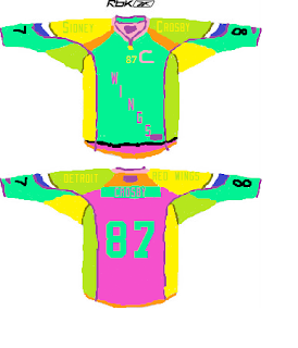
As you may remember, there was a plea heard crying out across Red Wings Nation just under a month ago for ideas and designs for the Red Wings' worst possible 3rd jersey, if they were to ever accept one.
The response was incredible. It was quick, it was funny, and it was UGLY.
But now we have all these entries and no winner. Yet. That's where you come in.
Much like how Operation: Curly Fries let good ol' fashioned democracy decide the winner between curly fries and roast beef sandwiches, we're going to let you, Red Wings Nation, the people this contest was designed by and for, pick the winners.
You'll notice on the left side of my blog a poll. Yeah, I upgraded the digs around here for this contest. Never had a poll before. I do now. But on that poll you'll see 16 choices for which design you think is the ugliest. But that's not because we only got 16 entries. In fact, we have double that amount. You'll see the other half of the entries posted by my partners in this whole contest ordeal, The Production Line. I strongly encourage you to pop over to their page and vote for the design hosted there that you think is the ugliest.
So here you go. 16 of the ugliest jersey designs you'll ever see:
Gold Eagle
1995 Inspired
Mauve Irrelevant
Purple Octopus
Tychkowski
Neon Abomination
Advertisement
Cup & Ring
Hey Hey Hockeytown
Samuelsson
Guardian Winter Classic
Guardian Comic Sans
Guardian Plain
"Der Wings" 6
Detroit Lions
Blue Baseball Look
Click any design to see a zoomed version.
So there you go. Half of the ugliest Detroit Red Wings inspired 3rd jersey ideas ever. Be sure to vote here and over on The Production Line on the other half, and leave your two cents on the various designs in the comments. I'm sure the artists would love to hear what everyone has to say about their work.


The Lions one made me laugh out loud. XD
ReplyDeleteI love the octopus one, too. Except that it looks like it was carefully designed and while hideously ugly, I think it's almost too well thought-out.
Neon abomination is terrifying.
Tychkowski get my vote though.
There are almost too many to pick from from the ugliness perspective. We almost need an elimination tournament to decide.
ReplyDeleteFor my vote, I took the 1995 inspired one, because it looked like the one that was most awful while still being the one that would be closest to what they would actually approve.
I just have to go with the purple octopus, great concept, well done, and still ugly.
ReplyDeletethe purple octopus is disastrous... in a positive way for the contest
ReplyDelete