Tuesday, February 15, 2011

This Bears Repeating

Since I can't really put it any better, I'm plainly going to rip off Nightmare on Helm Street:


USA Today is running a poll of its readers of who is the greatest player in any sport to wear 19.  I think the answer is obvious, but right now, The Captain is lagging far behind Johnny Unitas and some ancient named Bob Feller. 
We can't have this, so here's my call out to you Red Wing nation, get Yzerman that honor.  Only around 5K people have voted so far, so it can easily be swayed.  
Vote here, vote often.  Tell your friends.  Tweet.  Facebook.  Write.  Yell.  Etc.  Just get our 19 to #1.  
Here's the article.  
Steve Yzerman, once a Wing, always a Wing.

Go vote. And then go vote again on a different computer. And then get your parents and co-workers to vote.

Monday, February 14, 2011

What Lemieux MEANT to Say


By now, everyone's read what Mario Lemieux said in his statement following the Islanders/Penguins game on Friday. And everyone and their mother has given their opinion on if he was right to make the statement and if anything good will actually come from it.
After spending the entire night digging and making shady back-alley deals, I got my hands on the original draft of that statement. I think it provides a little more insight into his true feelings and intentions.

"Hockey is a tough, physical game, and it always should be, but what happened Friday night on Long Island wasn’t hockey. It was a travesty. It was painful to watch the game I love turn into a sideshow like that without being able to put Matt Cooke on the ice."

"The NHL had a chance to send a clear and strong message that those kinds of actions are unacceptable and embarrassing to the sport. It failed. Of course, by that I mean that beating the Pittsburgh Penguins 9-3 is unacceptable and embarrassing to the sport."

"We, as a league, must do a better job of protecting the integrity of the game and the safety of our players. And by 'our', I mean MINE.  We must make it clear that those kinds of actions will not be tolerated and will be met with meaningful disciplinary action towards anyone NOT wearing a Penguins jersey."

"If the events relating to Friday night reflect the state of the league, I need to re-think whether I want to be a part of it. And whether I need to try to sign Georges Laraque again."

Thank God that the PR department in Pittsburgh got a hold of it before it hit the press, imagine what would have happened in the media if Mario didn't edit that. 

*This is not really his original statement. Obviously.

Friday, February 11, 2011

On Cooke and Crosby and Concussions

Every mainstream media talking head is up in arms about concussions in today's NHL because Sidney Crosby MIGHT miss the rest of the season. MIGHT. As in it's not even known yet just how long he'll be out.

The saddest part of Crosby's concussion is that THIS is what it takes to get this issue addressed. A superstar getting hurt.

Oh, what's that, you say, Marc Savard?

You had a concussion long before Sidney Crosby did? And it was from his teammate, Matt Cooke? On a blatantly dirty play, prior to which you had what one can assume was a perfectly clean bill of health?

You see, my friends, THIS is what's wrong with the NHL. I mentioned it before in my now infamous newspaper interview with the Detroit Free Press.

"I believe the NHL has its own interests besides individual markets," [I] said. "They're trying to look out for the big picture."

Cooke, playing for Pittsburgh, takes out a Boston player, Savard, with what will be known as one of the dirtiest hockey plays this side of Claude Lemieux and gets away scott-free. Where was the "we've gotta stop this shit, pronto" discussion then? There might have been murmurs here and there, but no one was really hoisting that flag.

Fast forward to now. Here we have Crosby, Pittsburgh's shiny gold star, out indefinitely from what I believe to be incidental and minor instances that lead to what I've only seen as a 'mild' and 'grade I' concussion. And I say that as a HOCKEY fan. Not as a Gary-Bettman-hating-Sidney-Crosby-effigy-burning Red Wings fan. But now there's a big anti-concussion movement stirring in the ranks of the NHL front office.

Let's take a brief look at the Steckel hit. The Capitals are moving the puck up-ice, Steckel is rushing to join the play. Crosby is skating with his head turned, watching the puck with that Gretzky-esque "don't touch me, I'm a superstar" attitude.
Boom, Crosby gets blindsided.
Blindsided, right? That means dirty play, doesn't it?

NO.

Steckel and Crosby were doing the same exact thing, watching Hendricks carry the puck up ice. You can see in the replays that Steckel drops his shoulder right before impact. I believe whole-heartedly that that was an attempt to AVOID hitting Crosby. Think about it. If you drop your shoulder like that before hitting something, it's usually trying to make your profile slimmer to avoid getting hit. You see that more in hockey players sidestepping a check rather than making one.

You know what you don't see in players that are looking to avoid contact with another player? Leading with the elbow. That's what Cooke did. Just like in other plays where he's lead with the elbow. Or the knee. Or hitting from behind. Or some other illegal NHL action. The fact of the matter is Cooke has been involved is no many dirty plays wearing that Penguins jersey, it's absolutely absurd that he's only been suspended 6 games. 6 games for a dirty hit, that sounds about right, right? It would be better if that weren't a cumulative total. If you break it down, he's averaging less than 1 game's worth of suspension for the amount of dirty play he's done. Showcased by Don Cherry, starting at 1:14 in is a nice little montage of dirty plays he's been involved in. And through all of that, there's only been 6 games of suspension? And 4 of those came from what I think might be the least offensive hit of all of those.

Let's get back to the main issue here. Concussions are tricky, tricky beasts. Once you have one, you're more susceptible to more. Let's say (as is the likely case) that Crosby got his concussion in that play. That freak, accidental play. I don't care if you're a superstar in this league. If you have even a CHANCE at having a brain injury, you wait it out until you know damn well that you're good to go again. You don't go play again 4 days later and hope for the best.

Let's look at another concussion case that Red Wings fans are all to familiar with. Andreas Lilja. He missed 370 days returning from his concussion. That's a year and 5 days. Not just 4. And you know why? Because he did it RIGHT. He wasn't rushed back, and he didn't rush himself back. He took his time and made sure that he was good to go again. And when he did return, he was a solid addition to the team. He wasn't a liability.

No one knows who's really at fault for Crosby's playing against Tampa Bay. Was it the medical staff okaying him too soon, was it him lying to the medical staff to get okayed too soon, was it the coaches or some other influential person? We don't know the answers to that. But in his returning to that game against the Lightning, he made himself a bigger liability to the team than he helped them by playing. He's been out since. And we don't know when he'll be coming back.

So now the NHL has a problem they have to address. But let's be real here. This isn't about the NHL protecting the players. It's about protecting their assets. Do people in Phoenix buy tickets to see Marc Savard or Andreas Lilja? No. But they come to see the NHL's golden boy Crosby. So if he's not playing, the NHL is going to suffer. So now they are putting on the concerned hats and acting all worried about the players.

It's not about keeping the player's best interests in mind, or making sure that they're going to be okay post-career. It's about making sure their pockets are lined.

As always, comments are appreciated.

Thursday, February 10, 2011

The Stanley Cup Finals of Ugly Jerseys

As you may remember, there was a plea heard crying out across Red Wings Nation just under a month ago for ideas and designs for the Red Wings' worst possible 3rd jersey, if they were to ever accept one. 

The response was incredible. It was quick, it was funny, and it was UGLY.

But now we have all these entries and no winner. Yet. That's where you come in.

Much like how Operation: Curly Fries let good ol' fashioned democracy decide the winner between curly fries and roast beef sandwiches, we're going to let you, Red Wings Nation, the people this contest was designed by and for, pick the winners.

You'll notice on the left side of my blog a poll. Yeah, I upgraded the digs around here for this contest. Never had a poll before. I do now. But on that poll you'll see 16 choices for which design you think is the ugliest. But that's not because we only got 16 entries. In fact, we have double that amount. You'll see the other half of the entries posted by my partners in this whole contest ordeal, The Production Line. I strongly encourage you to pop over to their page and vote for the design hosted there that you think is the ugliest.

So here you go. 16 of the ugliest jersey designs you'll ever see:

Gold Eagle

1995 Inspired

Mauve Irrelevant

Purple Octopus

Tychkowski

Neon Abomination

Advertisement


Cup & Ring

Hey Hey Hockeytown

Samuelsson

Guardian Winter Classic

Guardian Comic Sans

Guardian Plain

"Der Wings" 6

Detroit Lions

Blue Baseball Look

Click any design to see a zoomed version. 

So there you go. Half of the ugliest Detroit Red Wings inspired 3rd jersey ideas ever. Be sure to vote here and over on The Production Line on the other half, and leave your two cents on the various designs in the comments. I'm sure the artists would love to hear what everyone has to say about their work. 

Tuesday, February 1, 2011

Some of the Worst... So Far

Last week, a call was put out to Red Wings Nation to design what would be the worst Red Wings Third Jersey imaginable. The responses we got were incredibly bad.

Luckily for everyone involved, that's great news.

Today is February 1st, leaving only 9 more days to enter your submissions. Some of you still are working on your ideas, and some of you are still looking for ideas. So to help you out, and also to showcase some of the terribly good or wonderfully bad designs we've already gotten, here are my 5 picks of the litter so far.

A few side notes before we get to the jerseys, though.

These are in no way meant to be finalists, those will be named later. But that doesn't mean that some of the designs you see here or also over on The Production Line today CAN'T be finalists, either. These are just examples of what we've gotten so far, to show the different ideas and mediums we've all received. You can use them to draw some inspiration, or just enjoy the varying degrees of ugly we're posting on our pages.

Now, without futher ado, my 5 jerseys.

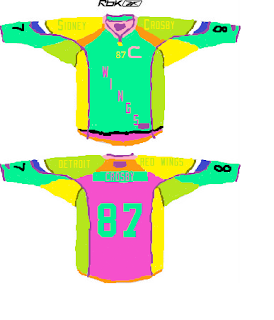
This monstrosity was one of the first and worst submissions I got. It's ugly on so many different levels. First, the color scheme is just harsh on the eyes. It looks like a firework factory explosion mated with a Easter egg dye factory and its offspring went on to mate with a Reebok jersey factory, all of which occurring in Gary Bettman's wet dream. And second, and I'm not sure if this is worse than the colors, is the Sidney Crosby overload. Is it implying that he'd be on the Wings, or is that going to be for every player on the Wings? Either way, it's plainly and simply ugly.


One of the more 'professional' looking types of ugly we've seen, this gets a spot on the page today for it's feasibility. This looks like a jersey we could actually be subjected to if the Wings opted to wear a third jersey. It touches on the classic Winged Wheel design but bastardizes it to the point of ad nauseam. And although I've always wanted to see a touch of black added to Wings jerseys, this design makes it look forced and unnatural, but also like it would be okayed by the NHL.


Another example that overuses the classic Winged Wheel design, this piece puts the wings anywhere they will fit, and then some places they won't. Also touching on the cliche circular, somewhat-related-but-not-really-related logo idea that nearly every other team team likes to use. Oh, and stripes. Lots and lots of stripes. I also really like how it doesn't even mention the team name. That's truly an ugly combination.


Another Paint submission, this one puts the Wings' current jersey into a blender with other third jerseys and pops out a new Wings jersey after 2 minutes on 'puree'. The V striping on the bottom of the jersey, the vertical wording on the sleeves, and yet another circular logo in the middle. The addition of black to the color scheme seems illogical and hackneyed again here, too.


I don't think words can even accurately describe the horror this jersey displays. It touches on the Wings' current jersey, but just like the Penguins', Bruins' and Flames' third jerseys this year, also reminds us the team's past. And, similar to the Blackhawks, Panthers and Predators, it features the ugly head of a creature no one ever wants to see face to face.


Remember, there is still time to get your own personal submissions in. These are just a sampling of the jerseys we've received. Be sure to check out The Production Line for a few more examples, and if you haven't already, get designing. And be sure to share your ideas and opinions in the comments.